Music Video
Advertising Poster
Digipak
Friday, 16 December 2011
Full Evaluation
Question One
In what ways does your media product use, develop or challenge forms and conventions of a real media products?
Conventions that we maintained
In this shot you can see our artist writing what he is singing, we found this effective as it gives our artist the image that he sings what he writes, and it gives him the authenticity we want him to have. This type of shot is quite common in the singer song writer genre as it it has become a must have convention and really shows off there musical talent. It could also be said its a bit of artist or genre showing off, as it is shows he world and other artists that they are more than just singing loudly with a huge crew around them.
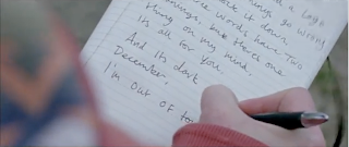 We have liked this shot to the very similar artist call Sheeran, we feel there is a close connection between our artist and Ed as they are very much the same type of artist. He also likes to show that he is more than just what Richard Dyer's theory would call a 'Star' by showing that he doesn't need anyone else and he as a 'pure' artist. Sticking with this convention we felt was just enough to make the link and association with the genre so we are able to say Lewis is a singer song writer, but then it means with other aspects of our video we are able to change and move away. Being associated with the genre means we are able to keep a loyal fan base of indie music, and also it means that we will be able to get into all the specialized music mags which would give us exposer and it would also mean we will be able to gain critical success which we would then be able to base our promotion and marketing strategy around.
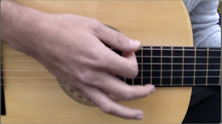 The second example if a convention we complied with was the idea of showing a close up of the artist playing the guitar, once again this is showing that the artist can do much more than just sing, it also tells us that he is actually musically talented and means there is more to him and he has music roots, it would also suggest that music part of his day to day life as learning a instrument takes dedication. Using this close up in a music video i think is used to make you focus more on the music rather than the artist and there image as there is nothing else to
 to distract you from the music, no colours no crazy things going on. This sort of shot also means that we still appease the old part of his audience and following, these people are the very music driven people, the people that have subscriptions to Q magazines etc. Adding in shots like this still means we are able to push for critical success not just chart success
Shot conventions that we developed
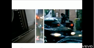
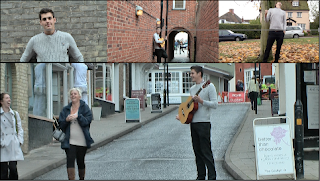 When planning for our music video we watch the music video from the plane white T's hey delilah, in this he is a constant split screen. We felt this was very effective but it wasn't the exact thing we were after. Due to this we decided to give ourselves more split screens and all of our main character. We did this as we felt give the audience a big dose of our artist and it imposes his personality on him. The reason that we think this is a conventions is the fact that its looks quite authentic, it means you are able to see different aspects of the artist at the same time, so in ours you can see him singing, him playing the guitar, but then you can also see him being a cheeky chappy at the same time, this is effective as it shows the consumer the complete artist. To create this effect we had to use final cut express, within this software we had to use tools which meant that we strunk some of the shots so we could fit more than one together. We also developed this conventions by the fact we have him interacting with other people rather than just standing by himself, it also isnt a mix of the performance and narrative, it is all part of the performance, as he is singing, or playing the guitar in all of them.
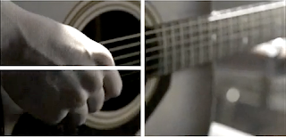
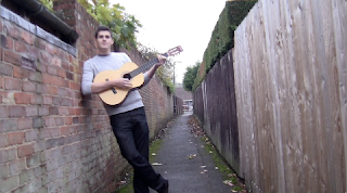 The second convention we developed was the idea of using jump cuts but within a music video, the way we used it in our was him leaning in a ally way playing, and in total we used 6 shots, progressively getting closer to use. We felt it gives the performace a little light heartiness, we felt that this differ from other music videos as most jump cuts are used in the narrative as its a way of showing a long walk or example without showing the whole walk, it gives the effect that you are missing out time.
In this short we also challenged something else, and its the type of lighting, as most other musics that we found that use this effect use it at night, where as you know its darker, we felt that a dark scene in our film wouldn't fit in, as we tried to give the effect that it was just another typical day in blighty, this means it was old damp, but not raining, this also meant that we could use the sort of costume we wanted, which was a casual
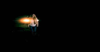
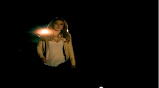 jumper, this is something else developed due to the fact that we felt that the image we were trying to create, according to Richard dyers 'star theory' we didn't want him to be a money crazed person that was only doing music for money and for the physical goods which come with it. We went for non designer outfits, we also wanted to balance out artist out, and by that i mean that we didn't want him not to be taken seriously because he was
too much of a cheeky chappy, so what we did was add in smartish trousers to try and equal it all out.
We also found in most other shots like the one we used, a women was used especially when it was getting closer to the camera, we think this is because of the sex appeal it brings, we didn't want to use this as we didn't want to distract the audience from our artist, and we didn't want our artists image to be him being a ladies man, we want that to remain a mystery to trying and keep his women audience members thinking they have a chance to be with him.
Shot conventions we challenged
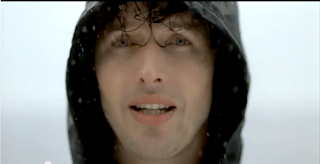 The first convention we consistently challenged in our music video was the idea that our artist would be a cheeky chappy, as you can see from the picture to the left and also through the whole of our music video is that we always has a smile, even when it comes to the performance, there is rarely a moment when we is not smiling, the reason we wanted to this was to give our artist a USP, this stand for a Unique selling point, the idea of this is to try and make our artist differ from every other similar artist out there, this is meant to mean that people will talk about our artist alot more than new upcoming artists. The only problem we could have with this is the fact that he could not then be taken seriously, this could then mean that we would lose critical success, but we have tried to level this out, with lots of close up etc which bring it back down to earth and more like other music videos out there.
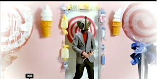
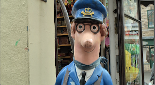 Another shot and theme convention we challenged when it comes to music videos was the quirky factor we employed, the idea that everything shouldn't be so serious. The conventions is normally maintained, but we felt due to the artist and his personality we felt that the shots, props and framing therefore wouldn't look out of place if they were not what most people would expect to see. We did this to create a focus point within a our music video, by this i mean, if someone saw the music video and then found the shot of postman pat particularly funny, the song would then stick in there heads longer, and then they would go talk to there friends about it, rather than another typical video they saw, which was of the same genre as ours. Also just to show how much we challenged conventions by using this shot, is to look at other music videos in other genres, for example the shot which is above, with the man in a elephant mask, its so random but works, and also it is a convention of that genre, that shot was taken from the man panic at the disco and from the music video nine in the afternoon.
Question 2
How effective is the combination of your main product and ancillary texts?
I feel that the film came out as well as we could have expected under the circumstances, i feel that with the equipment given to us we did a good job.
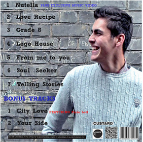
I feel that the link between all our media texts and the link with he artists is very strong as we have strong connotations, which is the fact its called nutella and there is a picture of nutella on his head, which could suggest that he is a bit quirky.
We have decided to not use many metaphors puns and other word meanings due to the fact we don't want to consumer to focus on the writing, we want it to be more on the picture as we feel they can get a lot more out of the images on all 3 texts rather than the words.
We opted for simple fonts on all of our media texts as we felt we didn't want to take anything away from the artist and we wanted to make people focus on him, we also didn't want to give the impression that he was something that he was not, and by that i didn't want use a fancy text or a 'bad man' font as he is neither of these. We want him to be a simple artist with just his guitar and music.
Question Three
What have you learnt from your audience feedback?
Question 4
How did you used media technologies in the construction and research, planning and evaluation stages?
In what ways does your media product use, develop or challenge forms and conventions of a real media products?
Conventions that we maintained
In this shot you can see our artist writing what he is singing, we found this effective as it gives our artist the image that he sings what he writes, and it gives him the authenticity we want him to have. This type of shot is quite common in the singer song writer genre as it it has become a must have convention and really shows off there musical talent. It could also be said its a bit of artist or genre showing off, as it is shows he world and other artists that they are more than just singing loudly with a huge crew around them.
 We have liked this shot to the very similar artist call Sheeran, we feel there is a close connection between our artist and Ed as they are very much the same type of artist. He also likes to show that he is more than just what Richard Dyer's theory would call a 'Star' by showing that he doesn't need anyone else and he as a 'pure' artist. Sticking with this convention we felt was just enough to make the link and association with the genre so we are able to say Lewis is a singer song writer, but then it means with other aspects of our video we are able to change and move away. Being associated with the genre means we are able to keep a loyal fan base of indie music, and also it means that we will be able to get into all the specialized music mags which would give us exposer and it would also mean we will be able to gain critical success which we would then be able to base our promotion and marketing strategy around.
 The second example if a convention we complied with was the idea of showing a close up of the artist playing the guitar, once again this is showing that the artist can do much more than just sing, it also tells us that he is actually musically talented and means there is more to him and he has music roots, it would also suggest that music part of his day to day life as learning a instrument takes dedication. Using this close up in a music video i think is used to make you focus more on the music rather than the artist and there image as there is nothing else to
 to distract you from the music, no colours no crazy things going on. This sort of shot also means that we still appease the old part of his audience and following, these people are the very music driven people, the people that have subscriptions to Q magazines etc. Adding in shots like this still means we are able to push for critical success not just chart success
Shot conventions that we developed

 When planning for our music video we watch the music video from the plane white T's hey delilah, in this he is a constant split screen. We felt this was very effective but it wasn't the exact thing we were after. Due to this we decided to give ourselves more split screens and all of our main character. We did this as we felt give the audience a big dose of our artist and it imposes his personality on him. The reason that we think this is a conventions is the fact that its looks quite authentic, it means you are able to see different aspects of the artist at the same time, so in ours you can see him singing, him playing the guitar, but then you can also see him being a cheeky chappy at the same time, this is effective as it shows the consumer the complete artist. To create this effect we had to use final cut express, within this software we had to use tools which meant that we strunk some of the shots so we could fit more than one together. We also developed this conventions by the fact we have him interacting with other people rather than just standing by himself, it also isnt a mix of the performance and narrative, it is all part of the performance, as he is singing, or playing the guitar in all of them.
 The second convention we developed was the idea of using jump cuts but within a music video, the way we used it in our was him leaning in a ally way playing, and in total we used 6 shots, progressively getting closer to use. We felt it gives the performace a little light heartiness, we felt that this differ from other music videos as most jump cuts are used in the narrative as its a way of showing a long walk or example without showing the whole walk, it gives the effect that you are missing out time.
In this short we also challenged something else, and its the type of lighting, as most other musics that we found that use this effect use it at night, where as you know its darker, we felt that a dark scene in our film wouldn't fit in, as we tried to give the effect that it was just another typical day in blighty, this means it was old damp, but not raining, this also meant that we could use the sort of costume we wanted, which was a casual

 jumper, this is something else developed due to the fact that we felt that the image we were trying to create, according to Richard dyers 'star theory' we didn't want him to be a money crazed person that was only doing music for money and for the physical goods which come with it. We went for non designer outfits, we also wanted to balance out artist out, and by that i mean that we didn't want him not to be taken seriously because he was
 too much of a cheeky chappy, so what we did was add in smartish trousers to try and equal it all out.
We also found in most other shots like the one we used, a women was used especially when it was getting closer to the camera, we think this is because of the sex appeal it brings, we didn't want to use this as we didn't want to distract the audience from our artist, and we didn't want our artists image to be him being a ladies man, we want that to remain a mystery to trying and keep his women audience members thinking they have a chance to be with him.
Shot conventions we challenged
 The first convention we consistently challenged in our music video was the idea that our artist would be a cheeky chappy, as you can see from the picture to the left and also through the whole of our music video is that we always has a smile, even when it comes to the performance, there is rarely a moment when we is not smiling, the reason we wanted to this was to give our artist a USP, this stand for a Unique selling point, the idea of this is to try and make our artist differ from every other similar artist out there, this is meant to mean that people will talk about our artist alot more than new upcoming artists. The only problem we could have with this is the fact that he could not then be taken seriously, this could then mean that we would lose critical success, but we have tried to level this out, with lots of close up etc which bring it back down to earth and more like other music videos out there.
 Another shot and theme convention we challenged when it comes to music videos was the quirky factor we employed, the idea that everything shouldn't be so serious. The conventions is normally maintained, but we felt due to the artist and his personality we felt that the shots, props and framing therefore wouldn't look out of place if they were not what most people would expect to see. We did this to create a focus point within a our music video, by this i mean, if someone saw the music video and then found the shot of postman pat particularly funny, the song would then stick in there heads longer, and then they would go talk to there friends about it, rather than another typical video they saw, which was of the same genre as ours. Also just to show how much we challenged conventions by using this shot, is to look at other music videos in other genres, for example the shot which is above, with the man in a elephant mask, its so random but works, and also it is a convention of that genre, that shot was taken from the man panic at the disco and from the music video nine in the afternoon.
 How effective is the combination of your main product and ancillary texts?
I feel that the film came out as well as we could have expected under the circumstances, i feel that with the equipment given to us we did a good job.
I feel that the link between all our media texts and the link with he artists is very strong as we have strong connotations, which is the fact its called nutella and there is a picture of nutella on his head, which could suggest that he is a bit quirky.
We have decided to not use many metaphors puns and other word meanings due to the fact we don't want to consumer to focus on the writing, we want it to be more on the picture as we feel they can get a lot more out of the images on all 3 texts rather than the words.
We opted for simple fonts on all of our media texts as we felt we didn't want to take anything away from the artist and we wanted to make people focus on him, we also didn't want to give the impression that he was something that he was not, and by that i didn't want use a fancy text or a 'bad man' font as he is neither of these. We want him to be a simple artist with just his guitar and music.
Question Three
What have you learnt from your audience feedback?
Question 4
How did you used media technologies in the construction and research, planning and evaluation stages?
Technology we used for our coursework on Prezi
This prezi is a extension of our evaluation where we talk about everything we used when it came to doing our course work
Thursday, 15 December 2011
Sunday, 11 December 2011
Group news (Important)
This week we found out that 3 man group has gone down to a 2 man group, this is because one of our groups memebers have left. This is especially hard on myself and India (my remaining group member) as other groups had 4 and now we have 2, this means we have to do twice as much work as other groups... But i wish Dan the best of luck
Tech we used for our project
Technology we used for our coursework on Prezi
This prezi is a extension of our evaluation where we talk about everything we used when it came to doing our course work
Friday, 9 December 2011
Evaluation Question 2
I feel that the film came out aswell as we could have expected under the circumstances, i feel that with the equipment given to us we did a good job.
I feel that the link between all our media texts and the link with he artists is very strong as we have strong connotations, which is the fact its called nuttella and there is a picture of nuttella on his head, which could suggest that he is abit quirky.
We have decided to not use many metaphors puns and other word meanings due to the fact we dont want to consumer to focus on the writing, we want it to be more on the picture as we feel they can get alot more out of the images on all 3 texts rather than the words.
We opted for simple fonts on all of our media texts as we felt we didnt want to take anything away from the artist and we wanted to make people focus on him, we also didnt want to give the impression that he was something that he was not, and by that i didnt want use a fancy text or a 'bad man' font as he is neither of these. We want him to be a simple artist with just his guitar and music.
Thursday, 8 December 2011
Subscribe to:
Comments (Atom)


